jerome arfouche
_the invisible cities - part 1
Welcome to the first part of the process pages for The Invisible Cities design ! In this part I'll discuss a bit of the reasoning, the research and initial work on the website.

The last major upgrade to my site was a couple of years ago. Changes included bringing in Kirby CMS for the first time, typography and some colour changes, and the first step in trying to make the website more responsive. Since then a lot has changed, and the list of "fix this one day" had become too long.

_background
Functionally, the site was a monster. There was a Kirby install for the website alongside a dual Wordpress install for the blogs. There was quite a bit of work maintaining the themes between Kirby and the databases. I'd used Kirby on a few other projects and was itching to just move everything over to a single CMS that simplified maintenance, backups, file structure and development. It was high time I wrote a proper responsive solution for the website because it barely qualified as adaptive. The photographs were small but still served the full size for all platforms and my fix for vertical images was quite awful. I was also tired of resizing the images by hand before upload, let the machines do the tedious work !

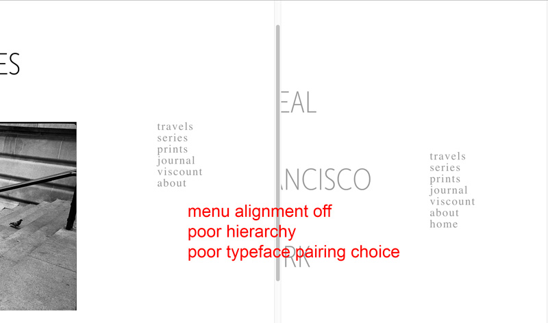
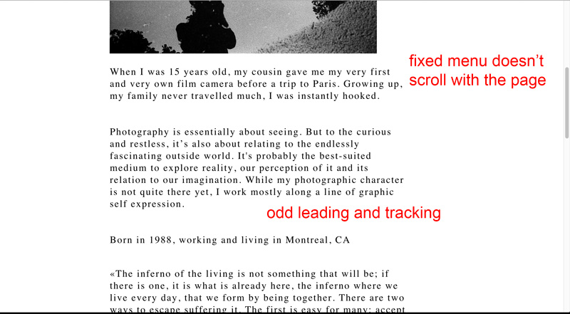
From a design perspective, the grid was a mess. The layouts weren't the same between the blogs and the rest of the site, the menu wasn't aligned to...in fact few elements were aligned with each other. There were also some poor typographic choices, like all caps on certain pages and uneven spacing. There was no type contrast and no content hierarchy, the large body serif type didn't marry well with the headline type.

the old layout
the old about page

_goals
In terms of design it wasn't so much a complete makeover but perhaps a better and stronger expression of the design I had in mind initially, but couldn't execute. It also brings a lot of technical improvements in the background that might not be visible but that would make life much easier to me, the maintainer.

At this point I started sketching and listed some goals. There was one client here, myself, but I used the site in different ways.

  1. I knew from my stats that most visitors were on phones or tablets, so I had to fix the responsive aspect. The biggest challenge here is images as we're dealing with a photography website.
  2. Performance. It's always important but it's much easier to design for it from the start than slapping it on later as an afterthought.
  3. I wanted a system to handle file uploads and resizing from a single high resolution image, and that kept the filesystem on the server tidy so I knew where to find my files. In the past I've had to replace them, edit individual images in a set, delete entire set, upload new ones and archives and backup some.
  4. I just wanted a great looking website to present my photographs that wasn't slow to load and that I could confidently invite people to go visit.
some initial sketches
comparing fonts
comparing fonts

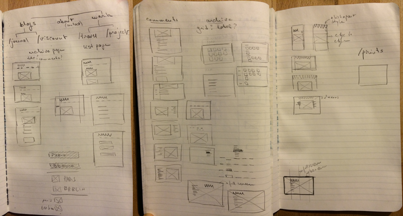
With that stated, it became clear the biggest challenges were going to be the responsive images and migrating two 5 year old blogs with hundreds of posts and thousands of images to a new CMS without breaking anything and with minimal downtime.